.png)

When using the PennWest primary lockup in conjunction with other text or graphic elements, a minimum amount of clear space surrounding the lockup must be used. Leaving space around the lockup ensures that it will stand out appropriately. The minimum clear space is equal to the height of the capital “U” in “University.” No additional text or graphic elements may appear in this clear space.

The same clear space rules apply to the PennWest wordmark and Pennsylvania Western University lockup.

The same clear space rules apply to campus and Global Online lockups and wordmarks, however the minimum clear space adapts to the height of the first capital letter in the campus name. No additional text or graphic elements may appear in this clear space.
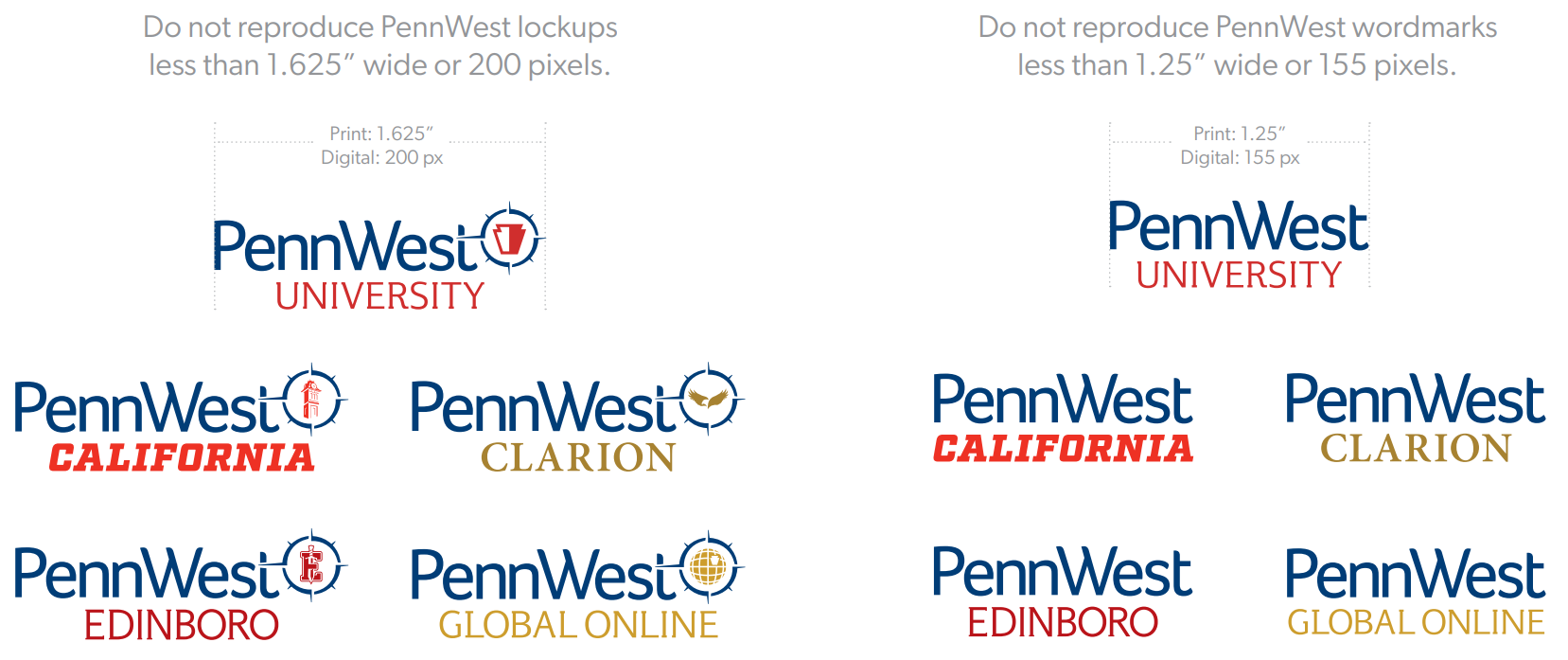
For optimal readability and clarity, PennWest lockups and wordmarks should not be reproduced smaller than the minimum sizes listed here.
Do not reproduce the Pennsylvania Western University lockup less than 1.5” wide or 185 pixels. For optimal readability and clarity, the Pennsylvania Western University lockup should not be reproduced smaller than the minimum size listed here.

When centering PennWest lockups, adjust the position of the mark to be centered from the left edge of the “P” to the right edge of the circular shape within the compass, not the extended eastward arrow. This allows the mark to appear correctly centered. Likewise with compass brandmarks, center the marks using the left and right edges of the circular shape, not the extended arrows.

PennWest return addresses on all mail pieces should have a consistent look, following the layout and specs provided on this page.

